Zara Men VHS
Packaging for men's fragrances. Inditex (Zara). 2016
PENTAWARDS 2017.
Silver. Body. Distributors/Retailers own brands.
ADCV 2017.
Gold. Graphic Packaging
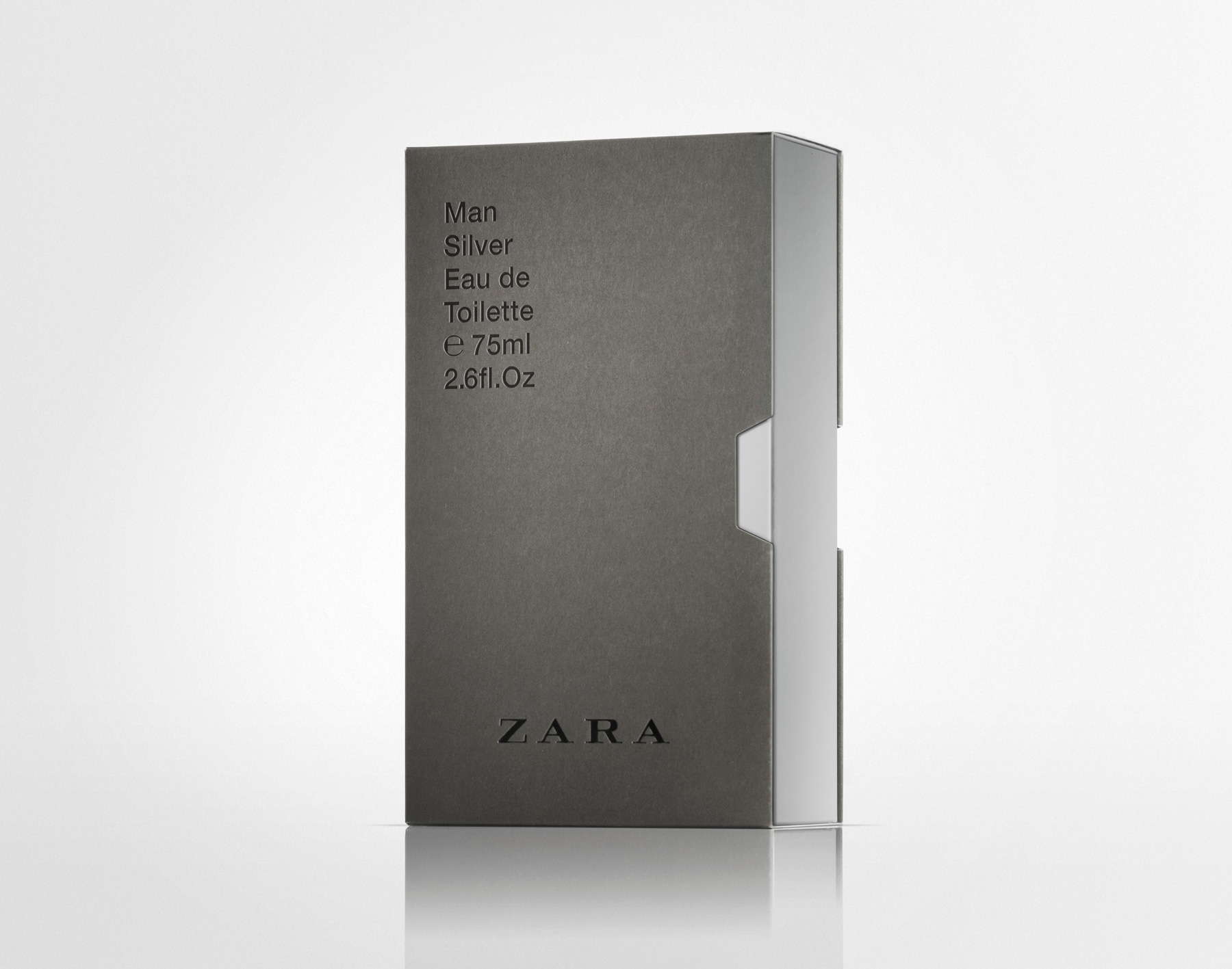
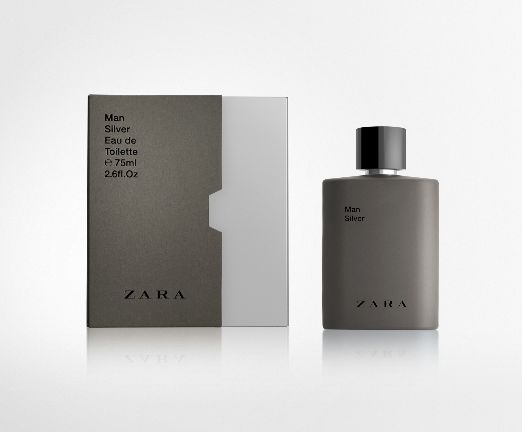
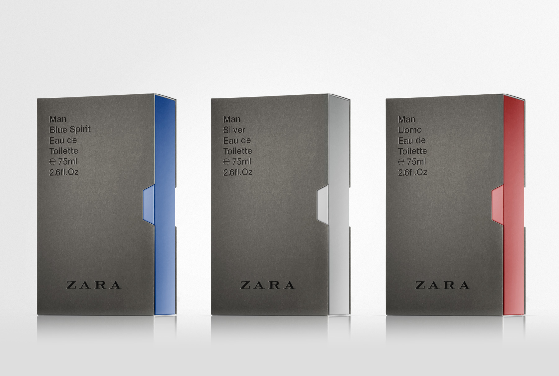
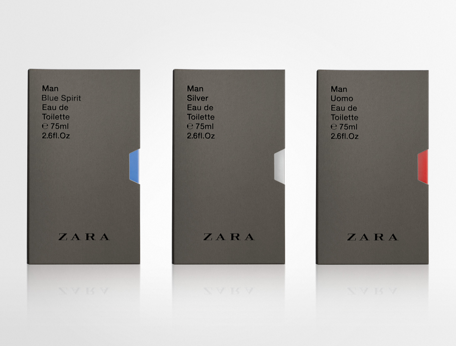
The brief required a new design for the boxes and graphic for most of ZARA male fragrances. The design had to be neutral and versatile enough to accommodate not only existing fragrances, but also new editions to be incorporated to the brand’s portfolio.
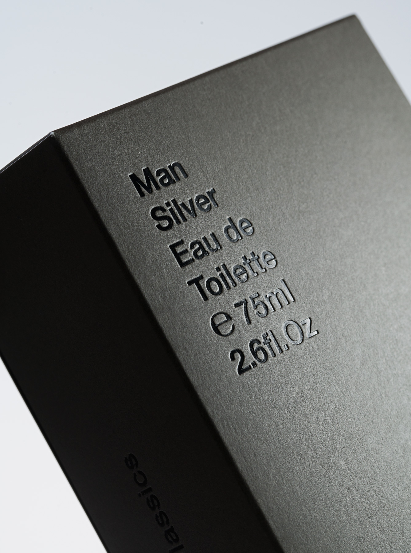
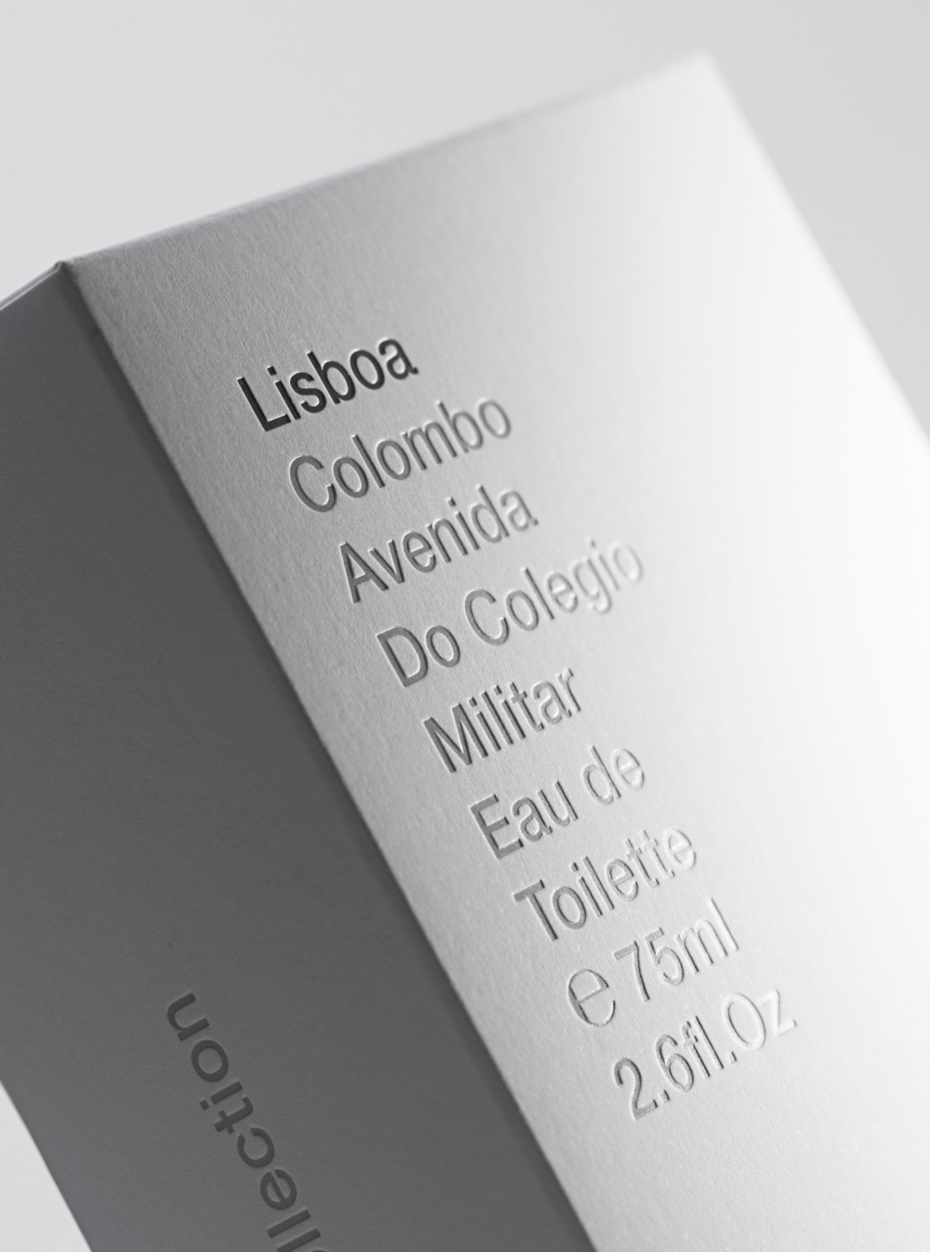
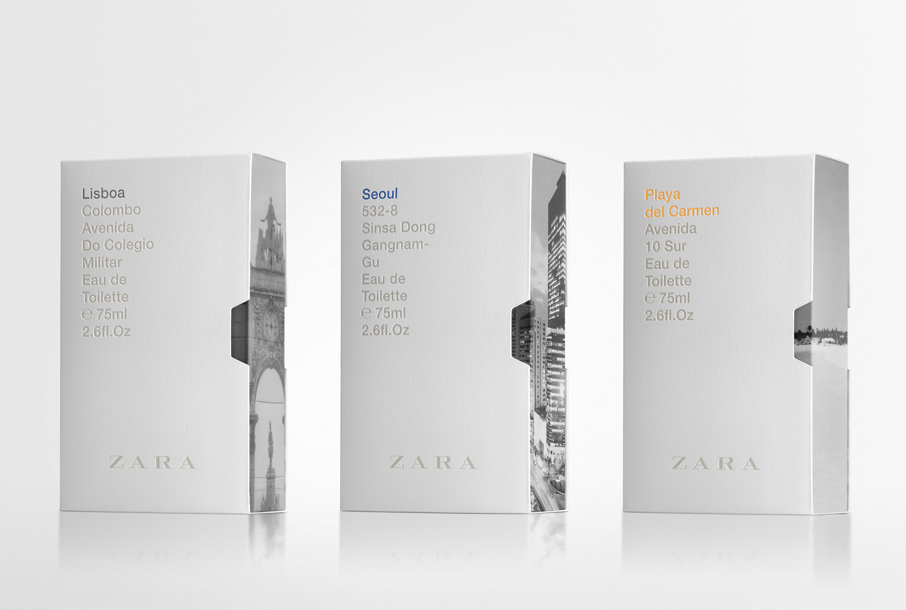
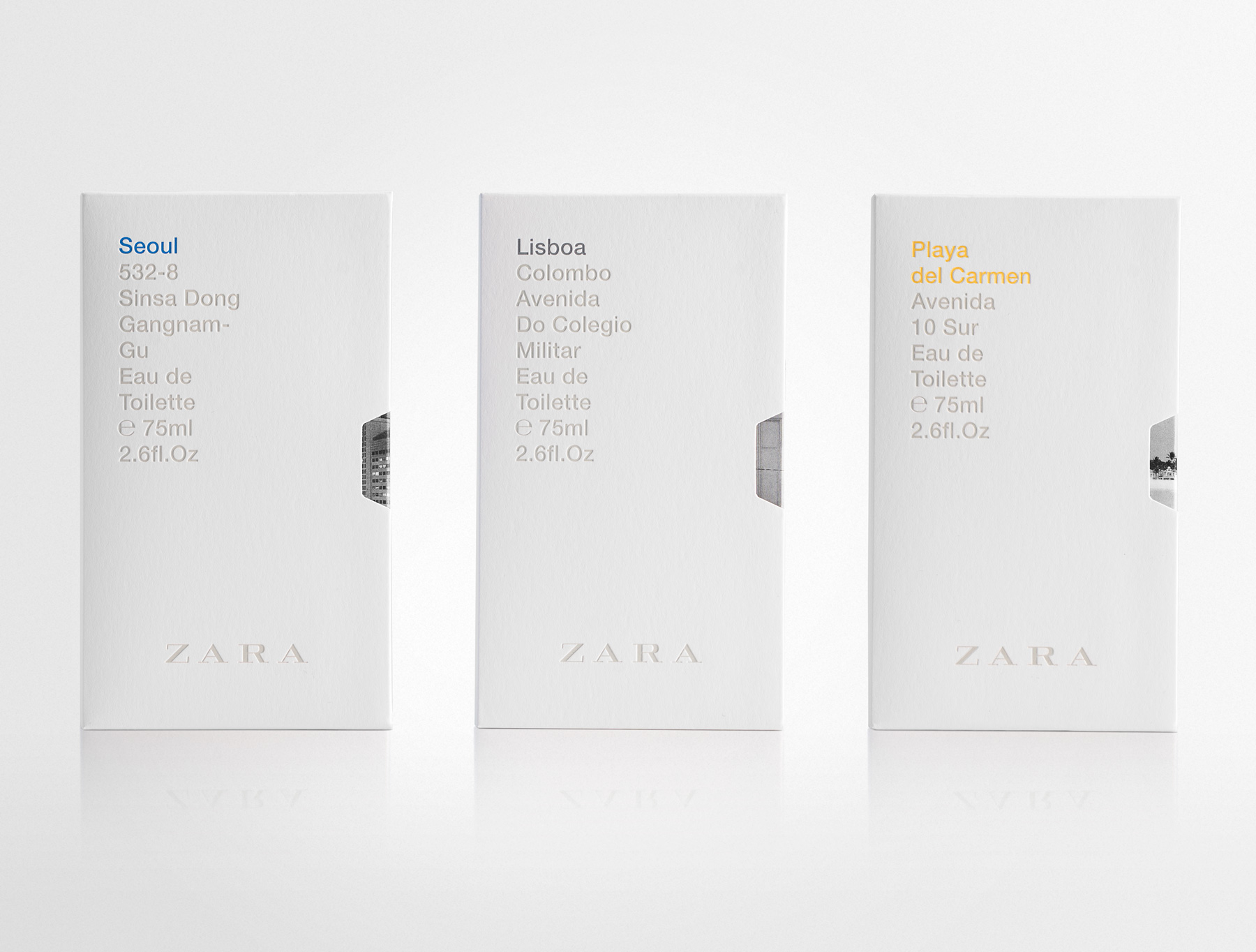
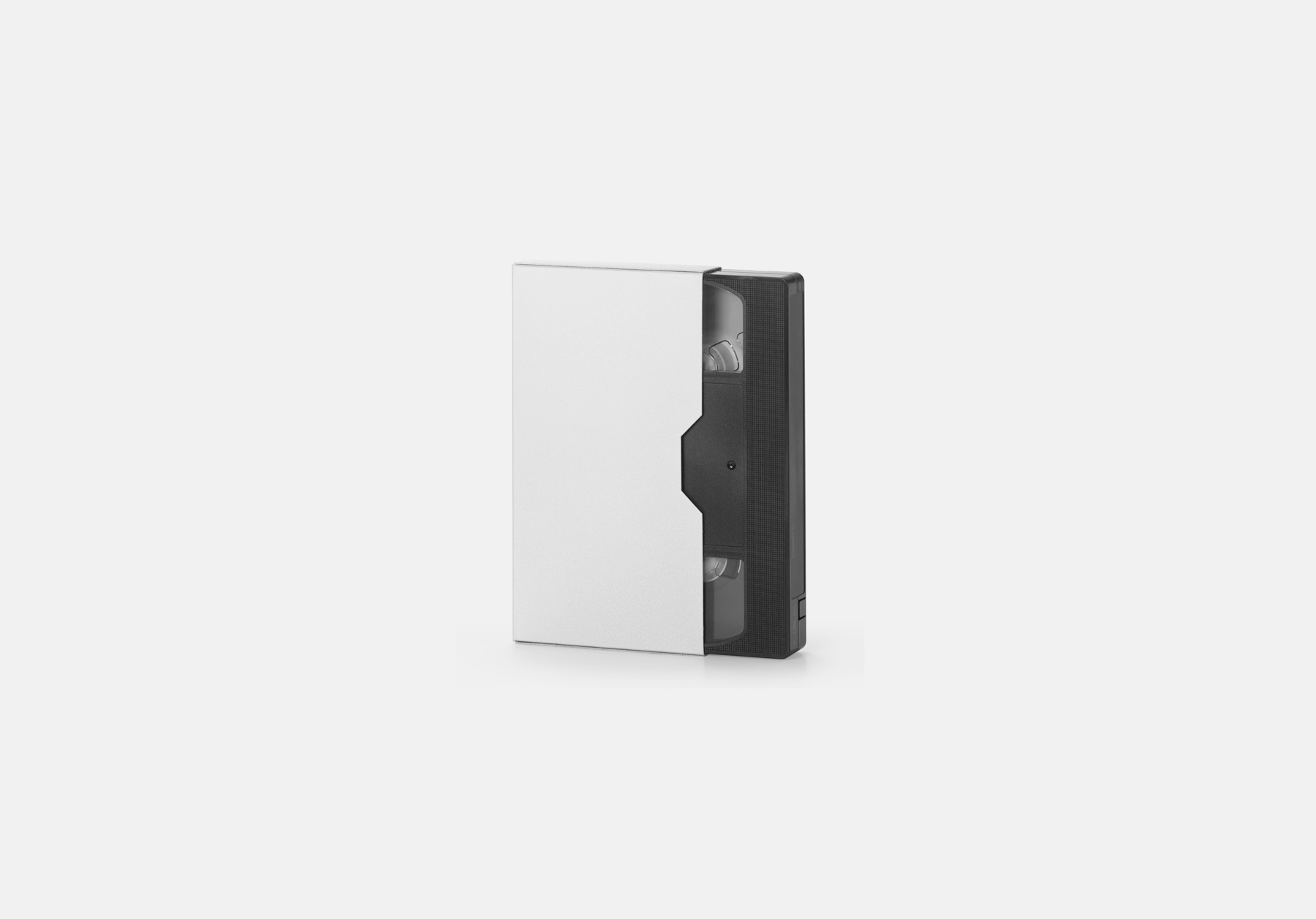
Regarding the box model, we chose a videotape case model adapted to the bottle size. This kind of packaging allowed us to play with an external cover and an inner box. Regarding graphic design, we decided to use a classic typo outside, Helvetica, simple composition and sophisticated finishings: blind emboss, bas-relief, and gloss varnish on the lettering in contrast with the matte cardboard.
The first fragrances with the new design were the classical ones: Silver, Uomo and Blue Spirit. Warm grey on the outside, and the matching colour of each fragrance in the inner box. This colour is visible on the opening side, same as videotape cases, and on the thumb notch.
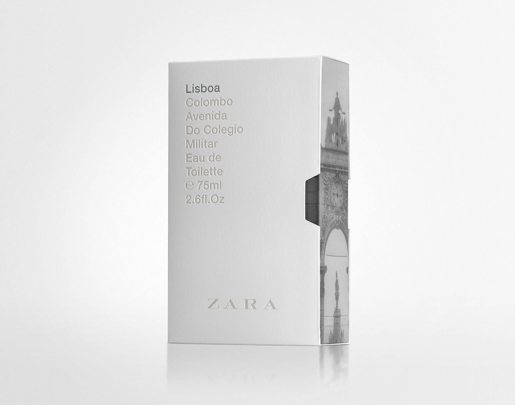
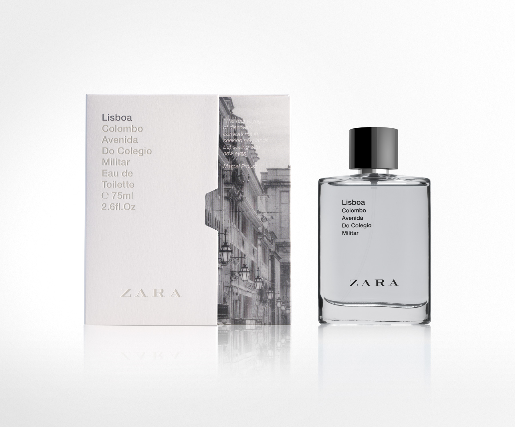
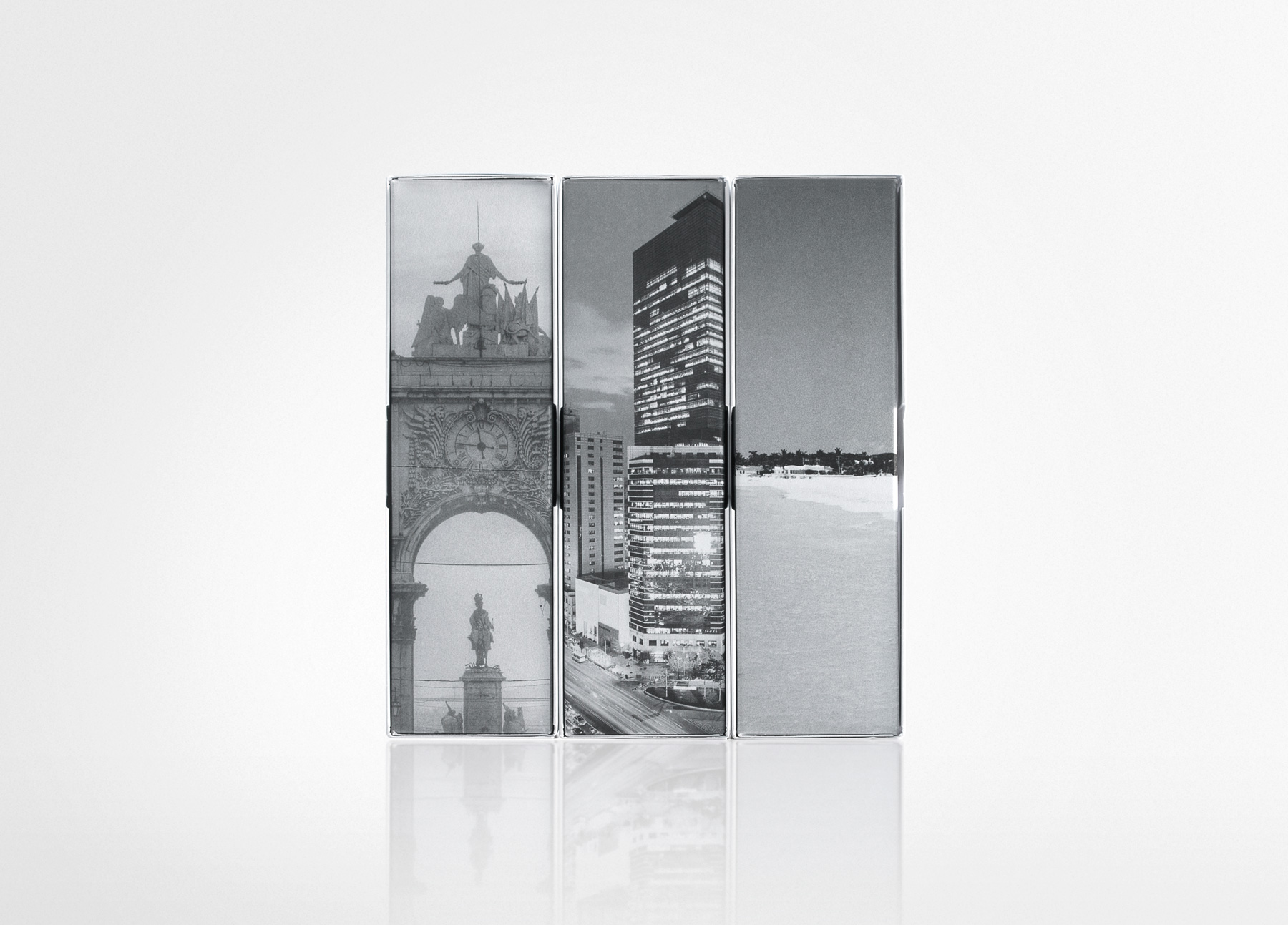
We applied then the new pattern to the Cities line (Cities where ZARA is present), as this pack solution is very suitable for it. The outer box is white and the city image fills all the inner box, and it is seen progressively as the inner box is removed from the case, in the same way as visitors discover little by little the city they travel to.
PENTAWARDS 2017.
Silver. Body. Distributors/Retailers own brands.
ADCV 2017.
Gold. Graphic Packaging